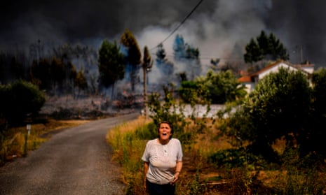
At the Guardian we want to ensure that the images we publish accurately and appropriately convey the climate crisis that we face. Following discussions among editors about how we could change the language we use in our coverage of environmental issues, our attention then turned to images. We have been working across the organisation to better understand how we aim to visually communicate the impact the climate emergency is having across the world.
Our goal is to provide guidelines for anyone working with images at the Guardian. We are also asking the agencies and photographers we work with to provide images that are appropriate to the changing narrative.
The concern over how best to depict the climate emergency led us to seek advice from the research organisation Climate Visuals, who have found that “images that define climate change shape the way it is understood and acted upon”.
It was important to address our own use of images and understand the processes that lead to image selection for our environmental and weather stories. When given a story, a picture editor or subeditor may have a short time to choose an image from our database, which is why the availability and prominence of climate crisis photography is a key element in the process. It can also be difficult for photographers to capture images that reflect global heating, weather patterns and wildlife extinction, especially when trying to depict what cannot always be seen.
We know, from years of experience, that people love polar bears and pandas, so it is easy to see how these appealing creatures have become the emblems for the topics of endangered species and what we previously termed as global warming. Often, when signalling environmental stories to our readers, selecting an image of a polar bear on melting ice has been the obvious – though not necessarily appropriate – choice. These images tell a certain story about the climate crisis but can seem remote and abstract – a problem that is not a human one, nor one that is particularly urgent.
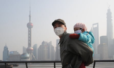
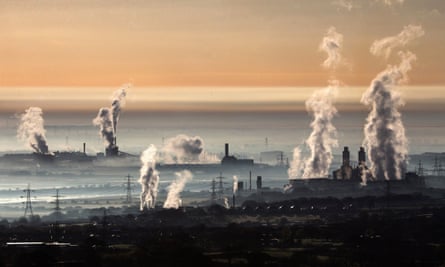
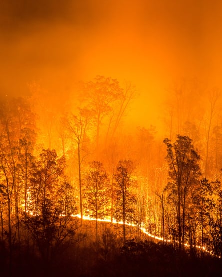
So it made sense when we heard that research conducted by the team at Climate Visuals has shown that people respond to human pictures and stories. Images that show emotion and pictures of real situations make the story relevant to the individual. Rather than choosing, say, an image of a smoke stack pumping out pollution or a forest on fire, such as this:
… we should consider showing the direct impact of environmental issues on people’s daily lives as well as trying to indicate the scale of the impact, such as these:
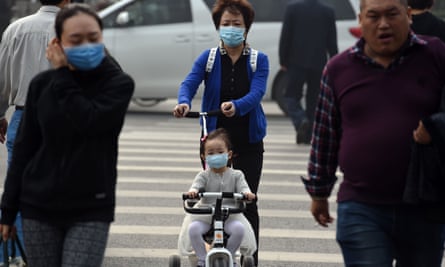
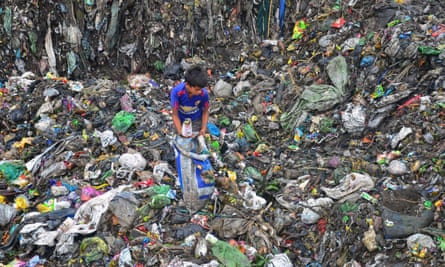
Photograph: Caisii Mao/REX/Shutterstock
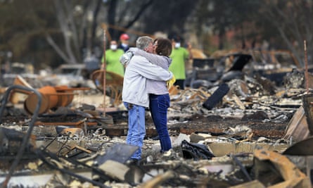
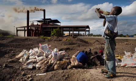
In the UK, the weather is a national preoccupation and as such a subject of tradition for British newspapers. People enjoying a sunny holiday weekend, or a fresh fall of snow at home or abroad can deliver some delightful and beautiful images:
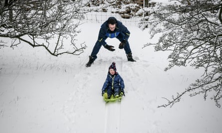
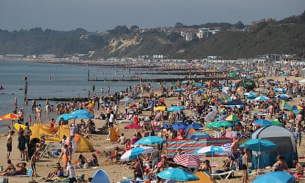
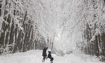
But as we have reported, the science tells us a much more sinister story of regular heatwaves and unseasonal weather being a defining indicator of the climate crisis. So, although scenes of children playing in fountains and everyone racing to the beach can be uplifting and irresistible, we have to be mindful of the tone of our journalism. This summer, the British media published dramatic headlines issuing climate warnings and covered in detail the negative impact of the crisis, but the images were typically of people taking pleasure in the environment. The contradiction in messaging, between the headlines and imagery, can undermine the effect of the reporting and how we perceive the risks.
In June this year we published a picture gallery on the heatwave across Europe. In its original form, this was of a lighter tone, but we felt on reflection this was wrong and disregarded the current context, so we amended the publication to include images that covered a range of human experience of the extraordinary temperatures.
The photographer Brook Mitchell made an impactful series about the drought in Australia affecting families in New South Wales, which we published as a photo essay in July. The environmental scenes of the scorched landscape were striking, as were the suffering animals, but the portraits and stories of the people battling the catastrophe really anchored the piece and drove the level of engagement.
It is an example of how, as picture editors and photographers, we are having to think again about finding the right focus. Many of the impacts to communities, biodiversity, agriculture, water and food supply represent the escalating crisis our planet faces, yet visually they can be far more challenging to depict. We need new imagery for new narratives. This can be challenging in a fast-paced newsroom but it is important to be nuanced and creative with search terms to unearth photography beyond the usual keywords of climate change, heatwave and floods.
As our stories make a journey from their initial point of publication through the various networks of social media we also have to be mindful of how the image is connected to the headline. We have to consider that the two must work together to allow the reader to make a broad sense of the article often simply at a glance. Relatable images that are not overly abstract have become a good choice.
However, in its simplest form, getting the emotional tone of imagery in line with the issue is critical, rather than the visual overload of society universally having fun in the sun. We hope that if we keep having these conversations, we will be able to have even more of an impact with our climate coverage, and others will follow suit.
If you are a journalist, a photographer or work with other news organisations depicting the climate crisis, please contact membershipeditorial@guardian.co.uk to join our conversation.
