Curtin University is proud to announce that it is once again the Australian organiser for participation in the UNEP-DHI EcoChallenge.
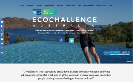
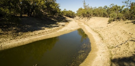
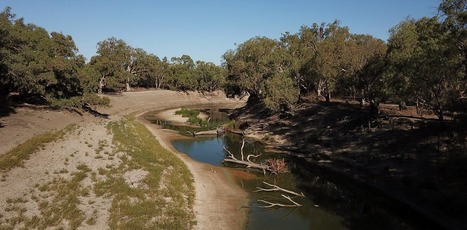
Water is essential for all life as we know it. A simple fact that sometimes feels forgotten as political and commercial interests take priority.
UNEP-DHI Eco Challenge Australia provides an exciting and authentic learning experience for students through the online strategic game “Aqua Republica”. Addressing national curriculum priority dimensions of Sustainability and Asia and Australia’s engagement with Asia the experience provides many learning opportunities across social studies, science, humanities, health and physical education, english, geography, and more.


 Your new post is loading...